The Landing-Page Mismatch That Quietly Killed My Best Ad
My ad earned cheap clicks and still lost money. The leak wasn't the creative - it was the broken promise between the tap and the landing page.
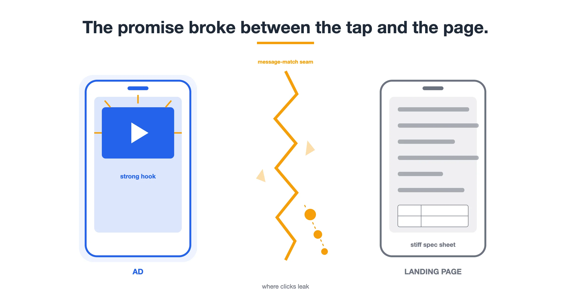
Practitioner playbook — a composite field guide written from the perspective of a Cross-Border TikTok Shop Seller. Figures are illustrative, not verified client results.
For a while I thought I was a decent ad maker. I was wrong. I was a decent thumb-stopper, which is a different and much less profitable skill. My hooks worked, my cuts were clean, and the click-through numbers looked healthy. What I kept missing was everything that happened after the tap: a landing page that quietly broke the promise my ad had just made.
The ad that taught me this was my best-performing short of a whole season. It racked up clicks, my cost per click stayed low, and I convinced myself the problem was the platform being stingy with conversions. It wasn't. The problem was that the ad sold one thing and the page sold a slightly different thing, and buyers felt the gap in the first second. This is the field guide I wish someone had handed me that week: how I now audit the chain from ad to landing page before I let a single dollar loose.
The Chain Nobody Audits: Ad, Click, Landing Page
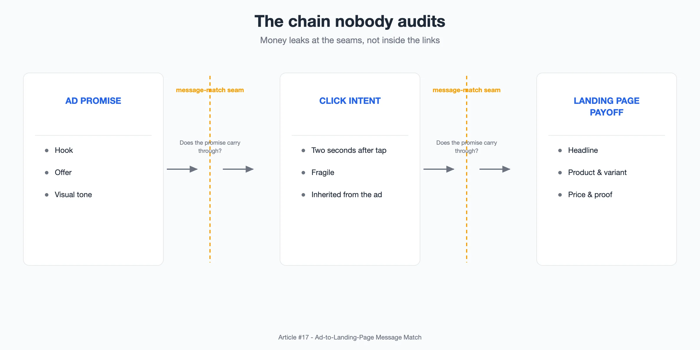
Here is the mental model that changed everything for me. A conversion is not one event, it's a chain of three links, and money leaks at the seams, not inside the links.
- Ad promise. The hook, the offer, the visual tone, and the implied "here's what you'll get if you tap."
- Click intent. The belief a shopper carries in the two seconds after tapping. It's fragile and mostly inherited from the ad.
- Landing page payoff. The headline, product, price, and proof that either honor or betray that belief.
Every one of those links can be individually strong and still lose, because the real test is whether the promise at each seam matches what comes next. When I only looked at my ad metrics I was grading one link out of three. Low CTR made me fix the ad. Low conversion rate made me fix the product. Neither instinct was pointing at the seam where the message actually broke.
The Four Mismatches That Quietly Bleed Budget
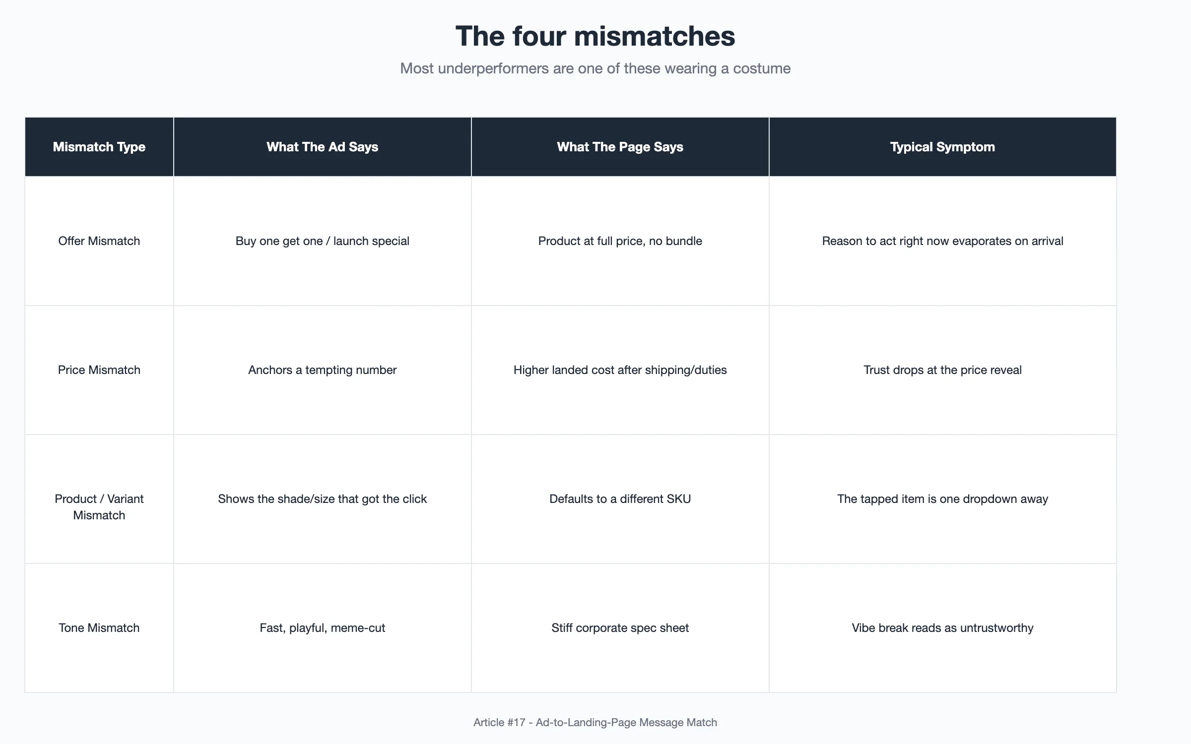
Once I started treating leaks as seams, the mismatches clustered into four repeatable types. I now run every new ad through this list because most underperformers are one of these four wearing a costume.
- Offer mismatch. The ad shouts "buy one get one" or "launch special," and the page just lists the product at full price with no bundle in sight. The shopper's reason to act right now evaporates on arrival.
- Price mismatch. The ad anchors a tempting number, and the page reveals a higher one once shipping or variant selection is factored in. As a cross-border seller I feel this doubly: FX, import duties, and shipping make my landed cost genuinely different across markets, so a single advertised price can be honest in one country and bait in another.
- Product or variant mismatch. The ad shows the shade, scent, or size that got the click, and the page defaults to a different SKU. The exact thing they tapped for is one dropdown away, which is close to a million miles away on mobile.
- Tone mismatch. The ad is fast, playful, meme-cut; the page is a stiff corporate spec sheet. Nothing is technically "wrong," but the vibe break reads as untrustworthy and people bounce before reading a word.
Each of these is a promise the ad made that the page didn't keep. None of them show up as a labeled problem in a dashboard, which is exactly why they're "quiet."
The Message-Match Check I Run Before Every Launch
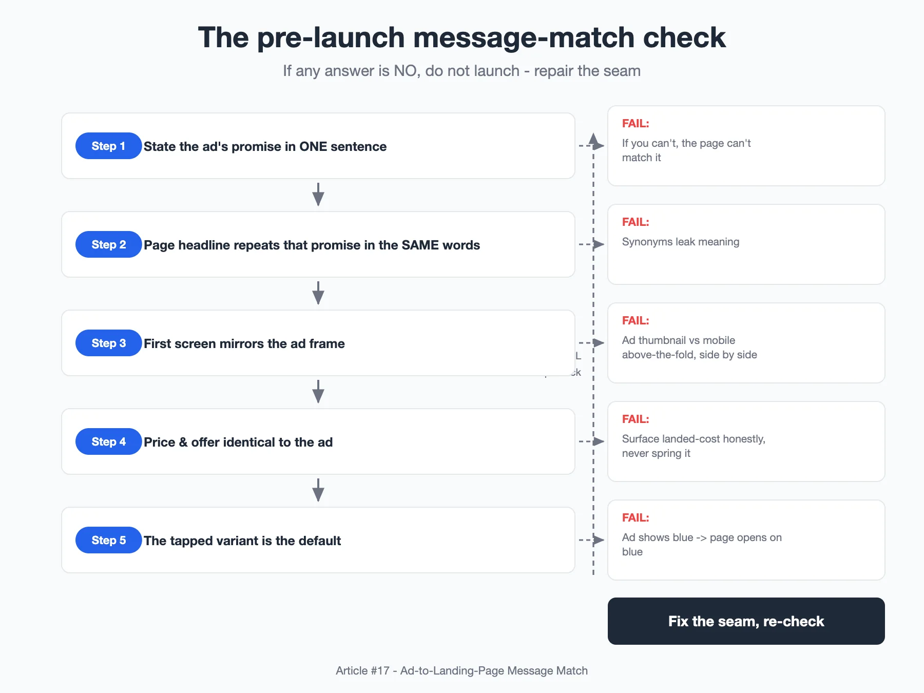
This is the actual ritual. Before I make a new campaign live, I run a five-question message-match check on the ad-page pair. It takes minutes and it's embarrassingly low-tech.
- Can I state the ad's promise in one sentence? If I can't say out loud what the ad is promising, the page can't possibly match it.
- Does the page headline repeat that promise in the same words? Not a paraphrase. The same core phrase. Synonyms are where meaning leaks.
- Does the first screen mirror the ad frame? I put the winning ad thumbnail next to a mobile screenshot of the page's above-the-fold view. If a stranger couldn't tell they're in the same universe, I fix it.
- Are price and offer identical to the ad? Same number, same bundle, same urgency. Any landing-cost difference by market has to be surfaced honestly, not sprung at checkout.
- Is the tapped variant the default selection? If the ad sells the blue one, the page opens on the blue one.
If any answer is "no," I don't launch. I go back and repair the seam. The rule is simple: the page inherits the job, and if the ad wrote a check the page can't cash, one of them has to change.
Rebuilding The Above-The-Fold To Mirror The Ad
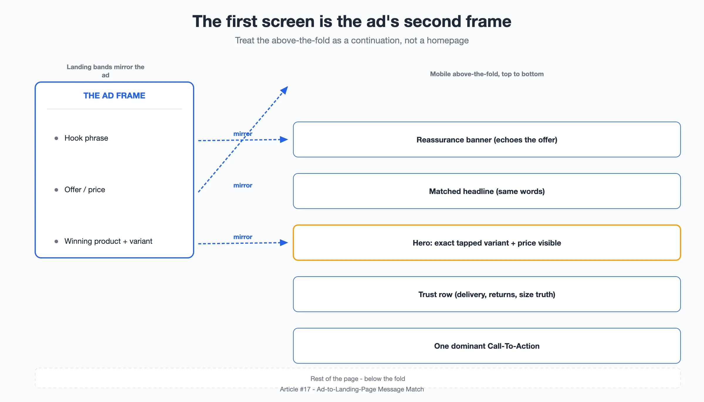
Diagnosing the mismatch is half the work; the other half is rebuilding the first screen so it mirrors the ad on purpose. I treat the above-the-fold as the ad's second frame, not a separate asset.
The stack I use, top to bottom: a thin banner that restates the offer the ad promised, so the buyer sees their reason to act reflected immediately. Then a headline that borrows the ad's exact phrasing. Then a hero image showing the specific product and variant that earned the click, with price visible without scrolling. Then a small trust row, because a cross-border checkout raises questions a local one doesn't: delivery window, returns, whether the size runs true. Then exactly one primary call to action.
The most common mistake I see, including in my own old pages, is a beautiful first screen that mirrors nothing. It looks like a great homepage. It is a terrible ad landing page, because a homepage greets all visitors and an ad landing page has to finish one specific sentence the ad started.
Reading The Funnel Break: Where Clicks Die
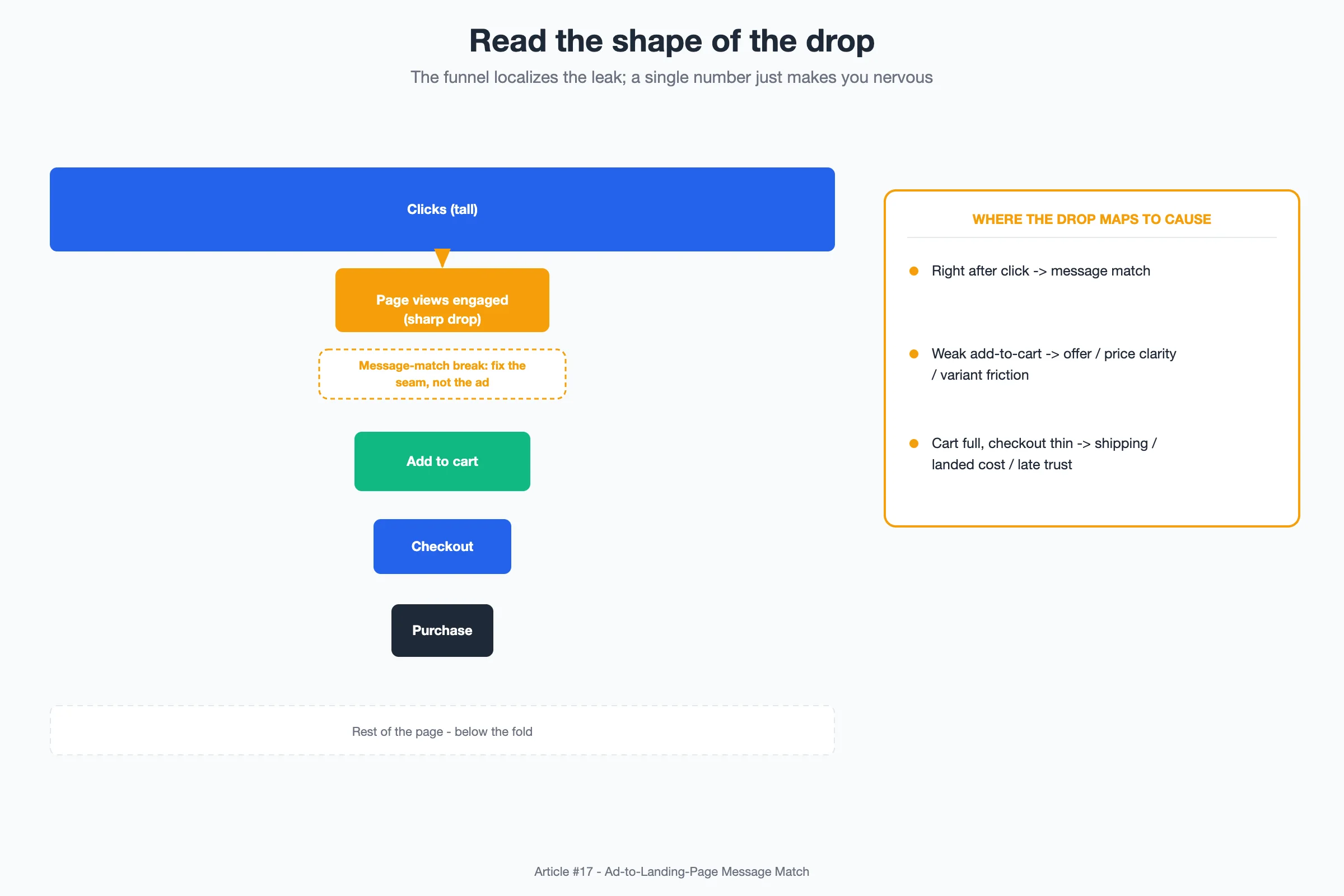
The funnel is where I confirm whether I actually fixed the seam or just rearranged deck chairs. The shape of the drop tells me which link broke.
A healthy ad-to-page pair shows a smooth funnel. My old problem pattern was a very tall first bar and a cliff immediately after it: strong clicks, then a steep fall-off before shoppers even engaged the page. In my numbers that early gap often swallowed a large share of otherwise-interested traffic, and I'd been blaming the platform for what was a message-match failure at the entry step. The diagnostic rule I keep:
- Big drop right after the click: message-match break. Fix the seam, not the ad.
- Steady interest but weak add-to-cart: offer, price clarity, or variant friction.
- Cart full, checkout thin: shipping, landed cost, or trust surfacing late.
Read top-down, the funnel localizes the leak. Read as one conversion rate number, it just makes you nervous and unscientific.
Localizing The Promise Across Markets
None of this matters more than it does in cross-border selling, because a "match" in one market can be a mismatch in another. The same ad concept has to survive translation of the offer, realistic landed price with duties and shipping, local size conventions, and payment expectations. I stopped writing one global landing page and started writing one promise per market. I re-record short ad variants where the hook leans on a price point or bundle that only holds true locally, so the seam I audited is real for that shopper rather than real in my home market and broken everywhere else. The chain is the same everywhere; the promise at each link is allowed to differ, but the ad and the page in a given market must always agree with each other. That single discipline removed more of my mystery budget leaks than any targeting tweak I ever made.
The Real Question: What Did Your Ad Actually Promise?
I used to ask "is my ad good?" Now I ask a narrower, harder question: "what exactly did this ad promise, and does the page keep that exact promise?" A great ad is easy to fall in love with and easy to grade in isolation. The page is where the contract gets honored or quietly broken, and the buyers who bounce never write to tell you why. Fix the sentence the ad started, and the traffic you already paid for converts more of itself. That was the free win hiding behind my best-performing, worst-converting ad of the season.
Sources:
- Google Mobile Usability and landing-page quality guidance – general benchmarks for page experience and message alignment.
- TikTok Shop seller help center on listing and offer display – how product, price, and variant data surface to shoppers.
- Baymard Institute checkout and e-commerce UX research (public summaries) – where shoppers abandon and why trust signals matter.
- CXL Institute articles on message match and post-click conversion optimization – the general practice of aligning ad and landing copy.
Disclosure: This piece is written from a practitioner's perspective to share a working method. It is not a customer testimonial, and any numbers are illustrative examples, not guaranteed outcomes.